Have you ever made a decision based on a report, only to find out the numbers were wrong? You’re not alone. Fixing the root of that problem starts with better quality data.
Most people don’t realize how much messy data affects their work. Problems arise frequently, for example: a missing number here, a duplicate entry there, and suddenly your reports stop telling the real story. You waste time checking results, teams lose productivity, and opportunities slip by.
But here’s the upside: cleaning up data is a lot easier than it used to be.
You had to be a data savvy engineer or a technically minded person in the past, but that’s no longer the case. In reality, you just need a tool that keeps things simple. For example, EasyMorph helps you solve things with a visual editor. But first, let’s explore bad data and why it’s so critical to solving it for your organization.
What Bad Data Looks Like (And Why It Happens So Often)
Bad data isn’t just an insignificant problem, it’s often a sign of a larger issue. It can point to old workflows, outdated data pipelines, and a lack of verification.
Unfortunately, many businesses haven’t fully adjusted to the way we work now. But the good news is leaders are realizing one important fact: good data matters. It keeps your organization productive, helps teams stay on track, and leads to better analytical decisions.
So, what does “bad data” actually look like? Here are a few common troublemakers you’ll likely run into:
- Missing or empty fields
- Duplicate records
- Messy formats (like dates or phone numbers that all look different)
- Out-of-range, invalid, or logically inconsistent values
You don’t need to be in data science to understand what these are. They show up in reports, spreadsheets, and dashboards. And once they’re there, they can break things without warning.
Why does bad data affect reports so often? One big reason is manual data entry.
Maybe a data entry specialist typed in rows by hand. Or maybe you brought in data from a partner company, and their process wasn’t as clean as yours. To fix this, let’s say you want to add validation or a way to make sure the data is correct before it hits your database or spreadsheet. Seems like this should fix the issue, right? This is more difficult than it looks because you have to check hundreds of conditions and data always looks different. So even if you had validation, it’s likely you can’t check through every situation to make sure the data fits the right structure. And to make matters worse, sometimes the data ends up looking different than it did when you first received it. This could break your validation rules. In the end, human error slips in and a few mistakes can turn into thousands of poor records that slow things down later.
Another reason is imports from different systems. One tool might format dates with dashes, while another uses slashes. Or you might get names in ALL CAPS from one place and lowercase from another. This can make it difficult to merge data or run reports that make sense. When your data is mismatched, you can’t feed the information to business intelligence or generate reports.
The last common issue is having no checks in place. When teams are too small or there’s not enough staff, it’s easy to skip review steps. That means it’s easier for problems to slip through with no one noticing. And by the time they show up in your reports or dashboards, it’s too late.
That’s why a solid data preparation process is important to the livelihood of your organization. When you can spot issues early, you avoid costly cleanup later. You save time, avoid confusion, and get a clearer view of what’s really happening in your organization.
What the Data Quality Management Process Looks Like
Let’s say your team pulls in a customer list from a partner system. At first glance, it looks fine: names, emails, phone numbers. But when you try to use it, you notice a few hundred phone numbers are missing area codes and others are stored in different formats. You can’t call or text without cleaning it up first. What seemed like a simple import ends up costing your team hours just to make the data usable.
That’s why the data quality management process is very important. The process can help you turn confusing or incomplete information into something useful and clear. Whether you’re working with a few hundred rows or hundreds of thousands, the process stays the same.
Here’s how it works, in a simple step-by-step overview:
Step 1: Identify
The first step in the data quality management process is to explore data. This will help you see any potential issues such as missing values, duplicates, values not within normal limits and other problems. This gives you a picture of what you need to fix and monitor in the future.
Step 2: Detect
Now you should understand what problems are in your data. At this step, you can create automatic detection workflows, so you know when the problems occur without having to investigate every bit manually.
Step 3: React
After spotting the issues, it’s time to do something about it. For instance, notify our team members. This can be in the form of email alerts, messages in Teams or Slack, or even creating issues via a ticket management system (including within EasyMorph Explorer Boards).
Step 4: Resolve
Finally, you act. This step is the last step that creates a fix to the data problem. This is often a recurring fix that will continue to help your data problems in the future.
That’s the full cycle. Identify. Detect. React. Resolve.
And once you build this habit, it becomes second nature. Clean data can provide your team with better insights, top-notch teamwork, and smarter decisions.
In short: The data quality process helps you find what’s wrong, fix it fast, and move forward with confidence.
Let’s see how to build a complete data quality management process with EasyMorph:
Step 1: Identify Data Problems
Before you can clean up your data, you need to know what’s wrong with it. This first step helps you get a clear view of your data so you can figure out what’s working, what’s missing, and what doesn’t look right.
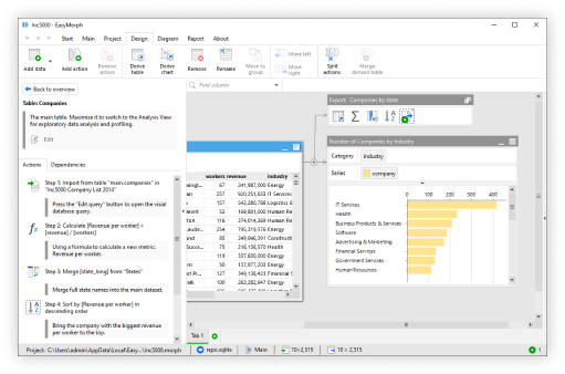
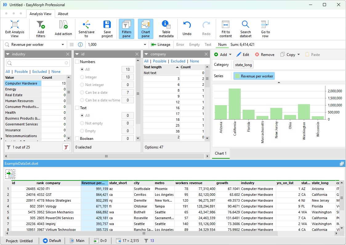
One of the best ways to identify problems is through profiling your data. In EasyMorph, profiling your data is simple because it’s all visual. All you need to do is import your data into Desktop and switch to Analysis View by clicking the upper right corner of your table.
Here’s what you can see:
- The number of null (empty) values in each column
- A count of distinct vs. duplicate values
- The most frequent values in a column
- Minimum, maximum, and average values for numeric columns
- A bar chart-style preview of how data you distribute data
This analysis view helps you get a quick overview of your data and if there’s any bad data in the mix. For example, if you open a customer list you can easily see how many customers are missing an email address, if names are repeated, and if information follows the same format.
This makes it incredibly easy to spot any inconsistencies.
Why it matters: This first step gives you a clean snapshot of what’s wrong and what you can solve in your data. You can immediately find out what type of data you’re working with and what problems need fixing. This step sets the foundation for everything else in the data quality process.
Step 2: Automatically Detect and Flag Bad Data
Now that you've found the problems with your data identified in Step 1, it’s time to detect bad data automatically, so you don’t have to go hunting for issues every time.
Let’s say you’ve already spotted a few issues. For example, missing emails, odd phone numbers, or duplicate names. Instead of checking manually, you can build rules that catch those issues for you.
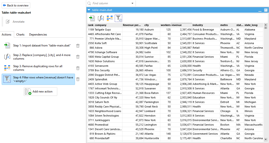
In EasyMorph, you can set up validation rules inside your workflows, identifying data quality problems as the data is being processed. For example, you can create a rule like “Phone numbers must be 10 digits,” or “Emails must include the @ symbol.” If something doesn’t meet the rule, it gets flagged.
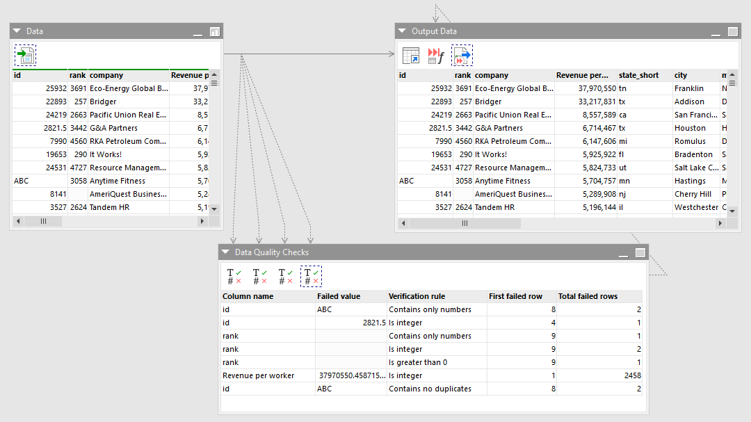
Here’s how this looks in action:
- You drag in your dataset
- Add a validation step with clear rules
- EasyMorph scans every row as it runs the workflow
- Anything that doesn’t follow the rules gets flagged automatically
You can take it a step further by organizing your validation rules into pipelines. Pipelines are like a to-do list for cleaning your data. Pipelines let you create a step-by-step process that ensures your data goes through checks and catches issues. Each rule helps find a different mistake.
This is perfect for when your team collects data from multiple sources. For example, many businesses use a sales tool and a customer service platform. Instead of manually checking your sales data and customer service data, you can use data contracts. These contracts are reusable rule-books that check against your data to make sure each rule is validated. And then EasyMorph will flag when your data is not following one of the rules. The great thing about Data Contracts is that you can write the rules once, and use them again.
Automated detection is a big deal because it saves time. You don’t have to review every dataset by hand, because once your detection rules are in place, EasyMorph handles it for you.
Step 3: React to Poor Data
Now that you’ve learned about how you can identify and detect data problems, the next step is Reaction. The point of this step is to ensure your team members know both when something goes wrong with your data as well as what they need to do to resolve it.
Bad data isn’t just a technical issue, it’s also a teamwork issue. If your team doesn’t know there’s a problem with bad data, they can’t fix it. That’s why it’s important to react as soon as issues pop up.
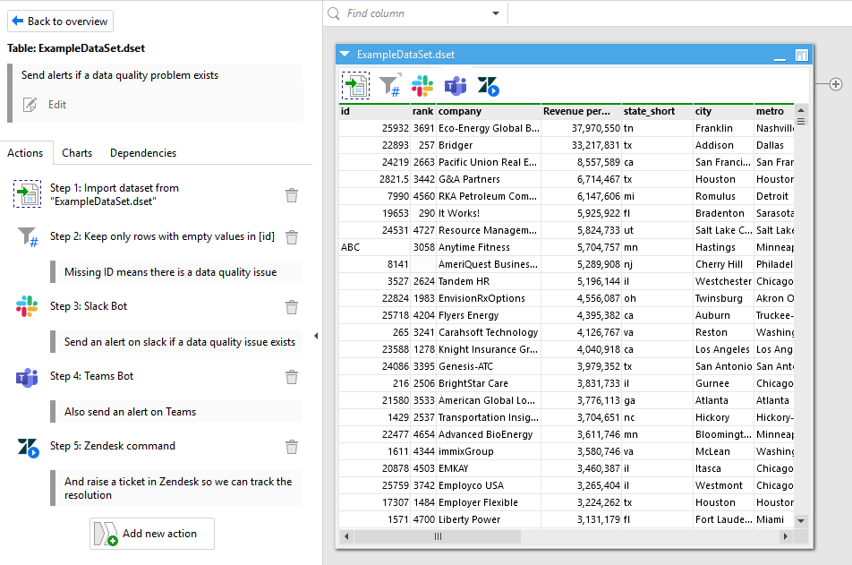
One of the first things you can do is react to bad data through notifications and alerts. You can set up alerts to go out through Slack, email, Microsoft Teams, text messages and more. For example, if you created a validation rule that catches missing email addresses, you can create an action to instantly message your marketing team. Now they know what’s happening and they can jump in to help.
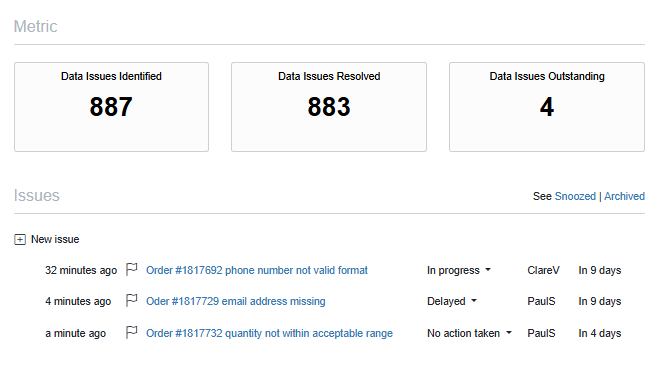
Here’s a way to make it even smoother for your data team. You can send error summaries. These act like report cards that tell your team what went wrong. They often show how many rows were affected, what the exact issue was, and where to find it in the dataset. Instead of digging through files, your team can get a quick snapshot they can act on.
One of the most handy parts of the reaction step is creating tickets in task management tools your team already uses. EasyMorph enables you to automatically create issues in Jira, Zendesk, or other task managers using API calls. You can spot the problem, open a ticket, and set up an action to assign it to the right person. The substantial part about this is that no one has to do it manually because you can do it automatically with EasyMorph.
As a note, if your team is using EasyMorph, you can create issues inside the platform itself. It has its own built-in system to track problems, assign fixes, and leave notes. That way, everything stays in one place.
Step 4: Resolve the Issues
First, you’ve identified the problems. Then you automated flagging. And now you’ve learned how to alert your team members. Now comes the last and most rewarding step: resolving the data issues.
This is where you can come up with a solution to fix your data problems. Some fixes are simple and can happen automatically, while others may need a team member to fix them. Either way, this step makes sure you can clean your data.
Here are a few easy resolutions that you can do:
- You can fill in missing values with defaults, averages, or placeholders
- You can standardize formats, like making sure all dates look the same or names use title case
- You can remove duplicate rows so each record only shows up once
The prominent part about EasyMorph is that it has over 200+ actions that can help you fix and resolve data issues. The list would be too much to mention here, but if you want to see a full list of actions, you can click here.
These fixes help solve data issues. But, not everything can be automated. Sometimes a value is just too strange to fix without context, which may require a team member to step in. Or someone entered worthless information in one of your fields. In those cases, it’s better to route the errors for manual review. For example, in EasyMorph you can build workflows to capture input from a real person and fix the data in the source system. This means, it acts as both a messenger about the issue and can also help you fix the problem at its core.
This is where your ticket system comes in handy. For example, in the previous step, you learned how to flag the issue and notify your team. In step 4, those same tools can track progress as a team member can jump in to resolve the data manually.
Once all the data issues have been fixed, you can choose what to do next. For example, you can export the clean data to a spreadsheet, send the data to a business intelligence tool straight from EasyMorph, or maybe you just want to share it with your team.
Practical Example: Before and After
So now that you understand the data quality management process, let’s look at a real life example to show you how you can use Easymorph.
Imagine your sales team sends you a messy spreadsheet. For example, some emails are missing, phone numbers have different structures, and a few rows say “N/A” in the revenue column.
Here’s what a sample of records from the messy version might look like:
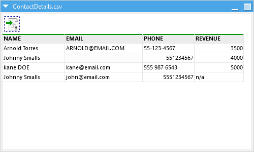
You can already spot a few problems:
- Johnny Smalls shows up twice
- One email is missing
- Phone numbers are inconsistent
- Revenue is missing or marked as “N/A”
- Names aren’t all formatted the same
Now let’s say you run this data through an EasyMorph data quality management pipeline. You would be able to fix missing values, remove duplicates, and clean up formatting. Here is what the clean version might look like:
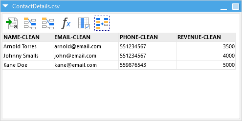
The good thing about this is that it’s easy to read, every person shows up once, the phone numbers match one format and the revenue fields are all listed.
This slight change can make a big difference. Clean data like this helps your teams and executives avoid confusion and prevents costly mistakes. This means you can make better decisions and operations run smoothly.
Make Better Decisions Without Being a Data Pro
Clean data doesn’t just make your life easier, it helps your entire organization. On the day-to-day level, accurate data can help you trust reports and decide without second guessing. It also boosts productivity and efficiency across your organization.
Even minor fixes can lead to fewer headaches for your data quality team and executives upstream.
But the best part is that you don’t need to be a data expert to do it. Anyone can learn to spot, flag, and fix data issues. You don’t need coding or a special degree, just a few clear steps you can repeat anytime.
If you want to see some more examples and a longer form explanation, you can check out our full webinar series below.